

BRAND REDEVELOPMENT SETS STAGE FOR NEXT 50 YEARS
The Mid-America Arts Alliance empowers artists and arts organizations to enrich the cultural and creative life in its region of Arkansas, Kansas, Missouri, Nebraska, Oklahoma, Texas and beyond. It awards funds for innovative art, develops and tours exhibitions, and offers professional development. In its 50 years, M-AAA has awarded more than $51 million in grants to more than 18,000 artists and cultural organizations, and engaged nearly 83 million children and adults in meaningful art experiences.
In preparation for its 50th anniversary and in accordance with its strategic plan, M-AAA partnered with Thoma for a significant rebrand that would better project the Regional Arts Organization’s breadth of services, programs and grant-making activity to its broad constituency-while highlighting its mission.
Thoma worked with M-AAA to crystallize and communicate the unique value proposition of the organization, develop and ingrain a “common language,” organize and synthesize all M-AAA brands/sub-brands into a cohesive whole, and integrate all into a common visual communications framework.
The result was a comprehensive brand overhaul and company-wide training that brought alignment, understanding and compelling visual assets to life.
Tactics:
- Review of existing audience research
- Workshops with internal leadership cohort to outline objectives and use needs for each work area
- Update of existing logo and development of an organization “descriptor” to increase understanding of what the organization is and does
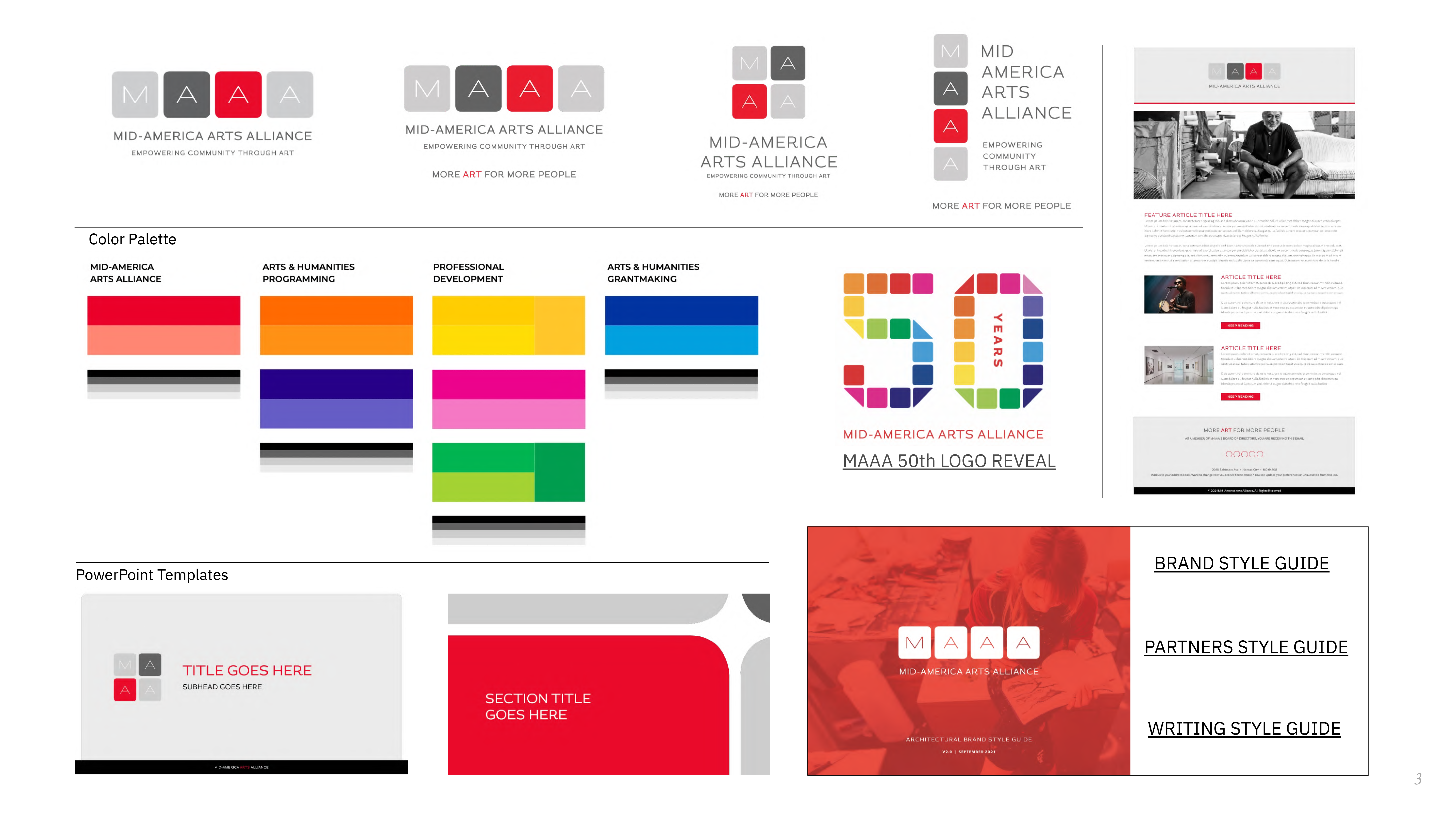
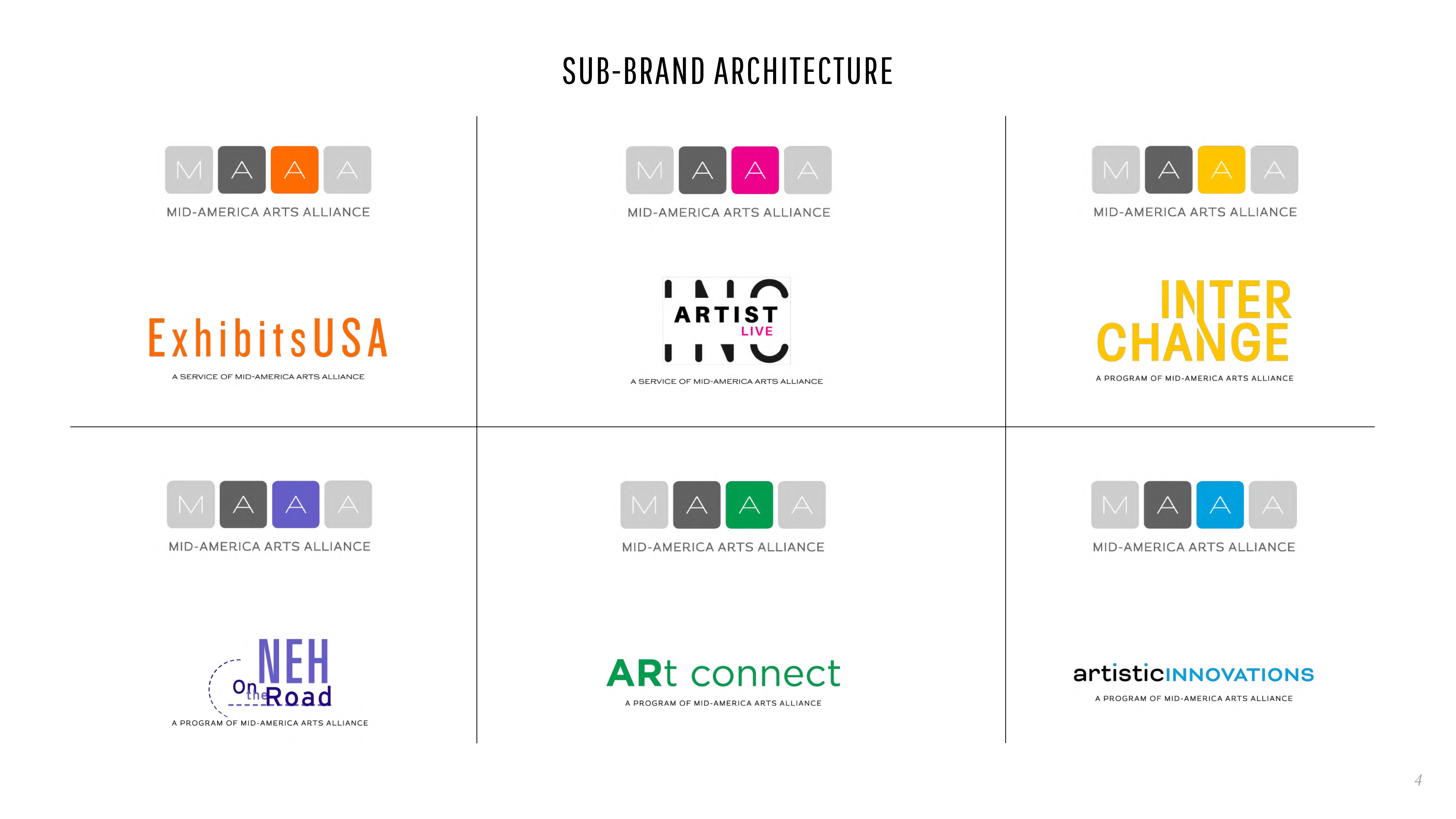
- Creation of a complex visual brand architecture using the color wheel to visually organize M-AAA’s programs, services and grant-making activities
- Redevelopment of more than 15 logos to compliment the overall M-AAA logo and brand while organizing them under their appropriate service areas by color
- Creation of a full suite of communications tools to support all aspects of M-AAA and it’s varied activities
Outcome:
The brand launch coincided with the kick-off of the 50th Anniversary and included development of a “50 Year” animated graphic icon unveiled to the board and featured on the website and building signage. All employees received brand/culture training and were equipped with two use guides, a robust graphic style guide and a writing style guide to assist their incorporation of the new visuals and written assets into their program communications. A new website was developed utilizing the new brand architecture with emphasis on robust navigation and story-telling.